The Name
The name speaks to the tactile, user-centric nature of their user experience business, as well as the shared lines between art and science that define interaction.
The Mark
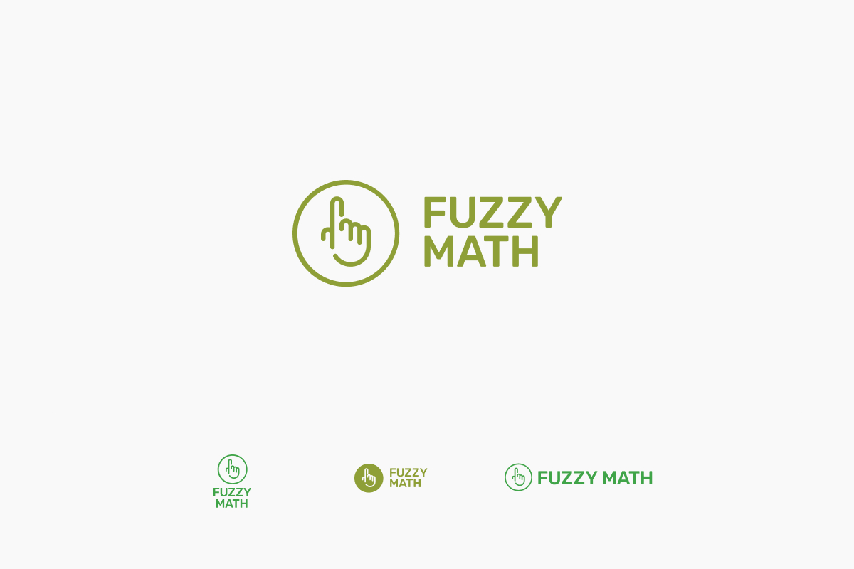
To further emphasize the tactile nature an iconic “pointer hand” was used formed from the FM initials.

Old meets new
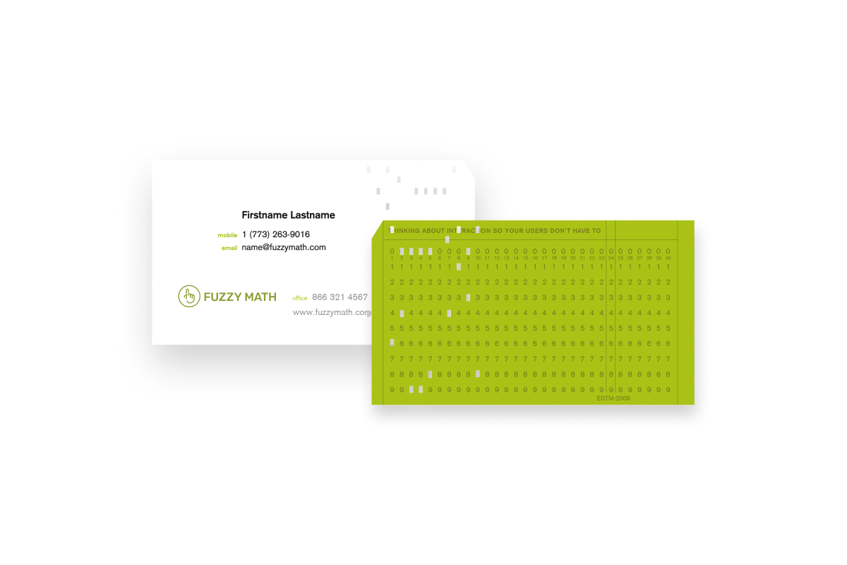
A fun (but involved) idea helped sell the concept of tactile: mimicking the shape of old punchcards for the business cards. The punches had to be laser-cut but the effect was remarkable.

Simplicity
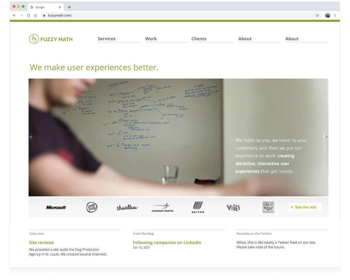
The site was a minimal color palette to support the new brand: green, gray, and black. This helped keep things simple and clean but also put emphasis on the content itself.
