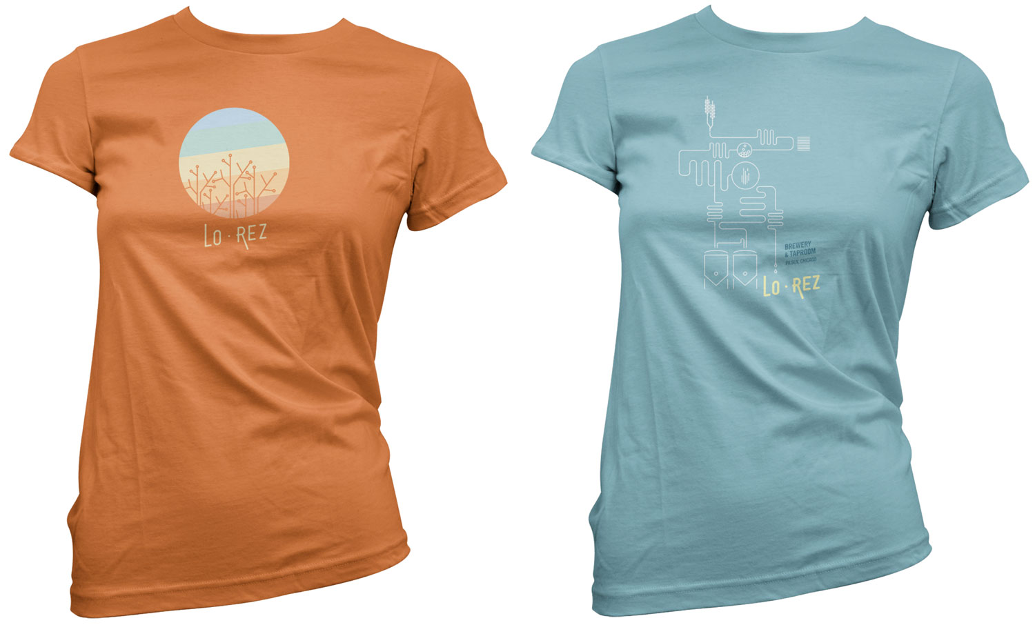
The mark conveys community, communication, and works well on a wide range of physical goods. A brand strategy was also developed around the idea of high and low tech.
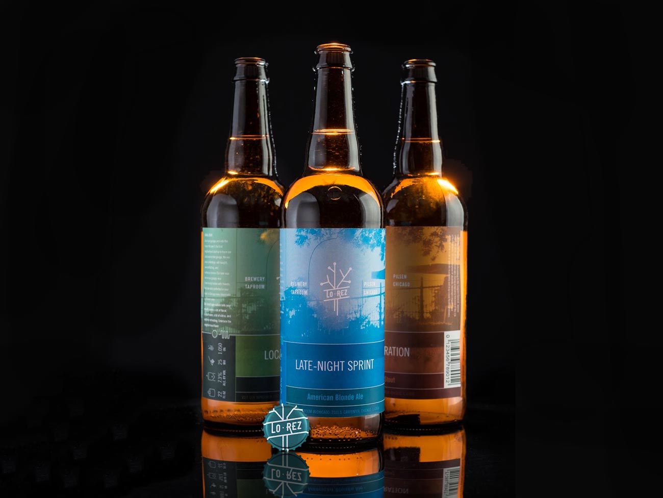
Bottle Labels
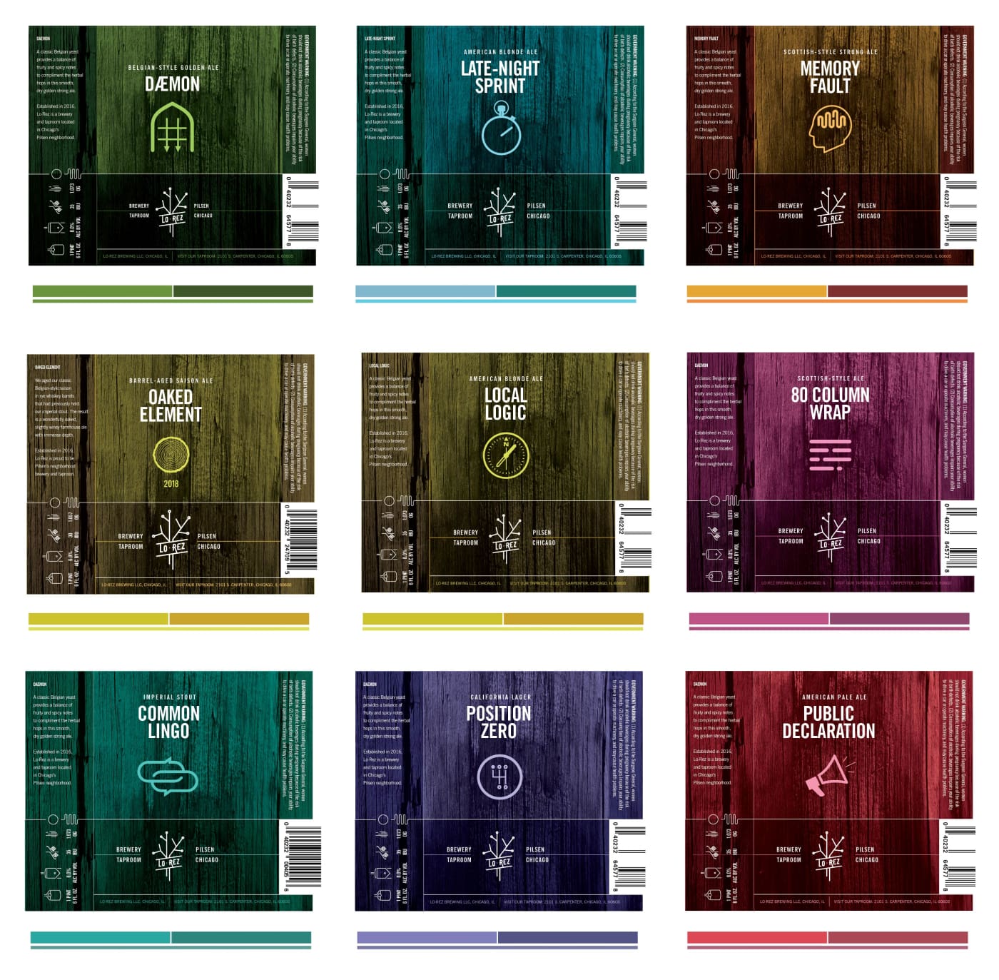
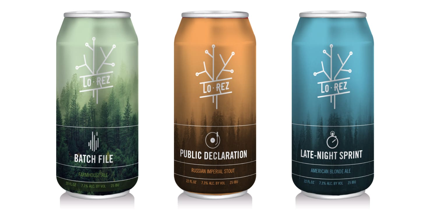
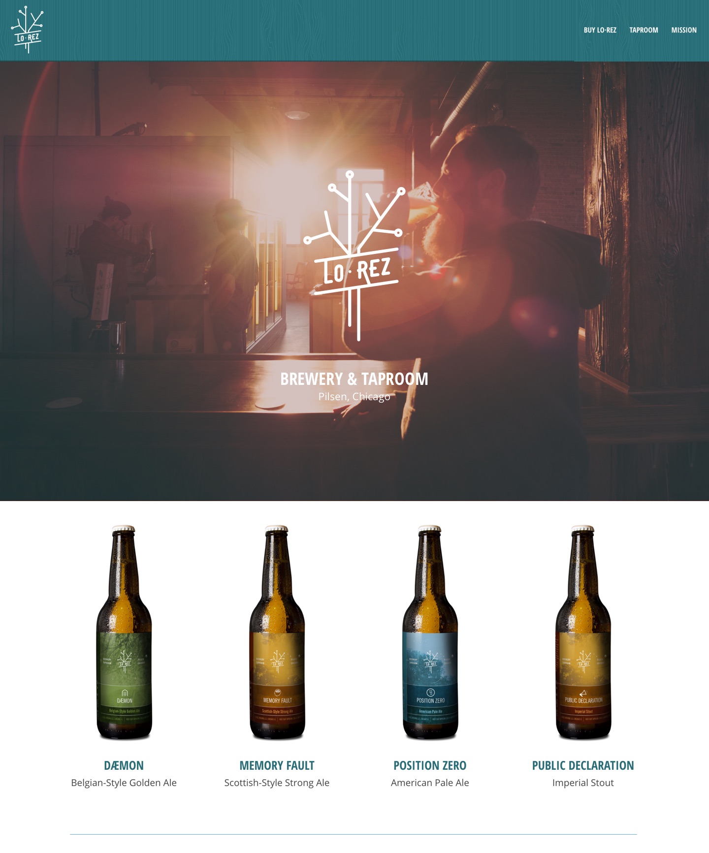
In addition to the label design system we pushed Lo·Rez to connect the names to their main brand concept and we developed a naming system which combined the craftsman nature of beer and the community to the technology of their shared history.
The label system used iconic glyphs to represent each concept.
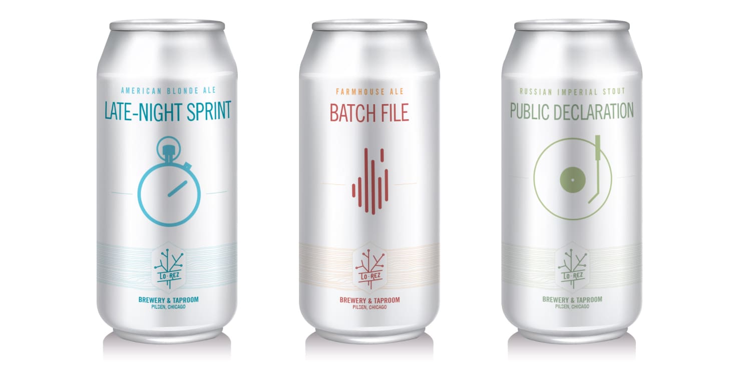
Can (concepts)
These were early sketches that were meant to push the founders to think of something bold that would stand out in a extremely crowded market.
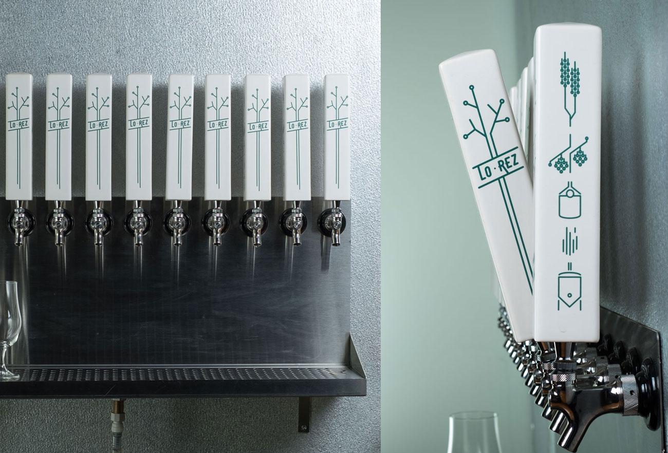
The tap handes extend the technology line art and show the brewing process in what we lovingly refer to as the hieroglyphics. It also demonstrates the flexiblity of the logo mark.
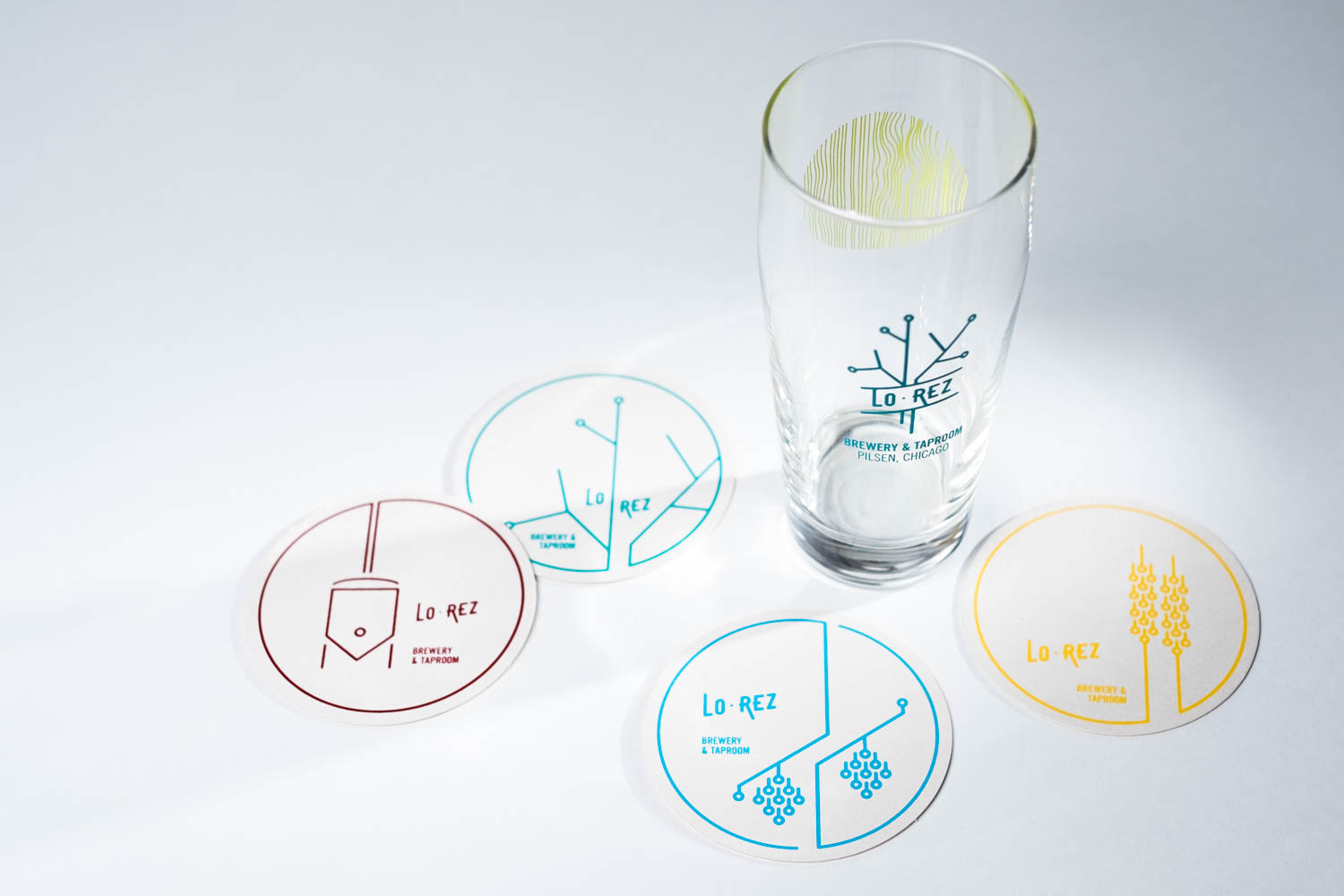
Bright. Fun. Simple. The illustrations play off of the main mark and extend the idea of technology and hands-on work.
A core visual treatment that communicates the brand concept is the very graphic, technical mark, knocking out of organic or natural textures. Here we shot photography around the taproom location to emphasize the sense of connection to the community.
Lo·Rez was interested in having a more art-based type shirt and requested that some of the shirts not even have the name or Brewery & Taproom text.

